8.31.2016

Hello Today *Hip Kit Club*

Hello everyone! 

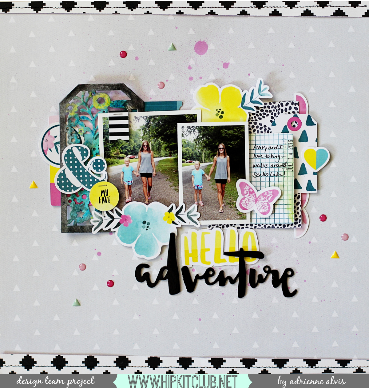
I'm here today sharing a layout that I created using the lovely August 2016 Hip Kits! Recently, my kiddos started back to school and I wanted to create a page that focused on the photos that I took of them on their first day back.

hellotoday1

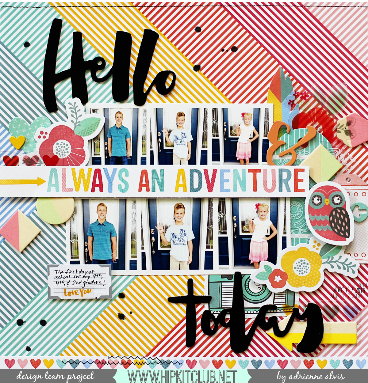
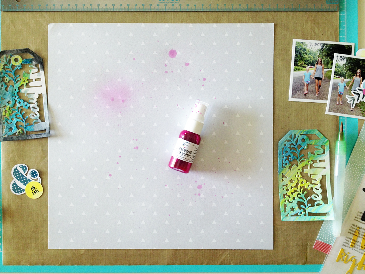
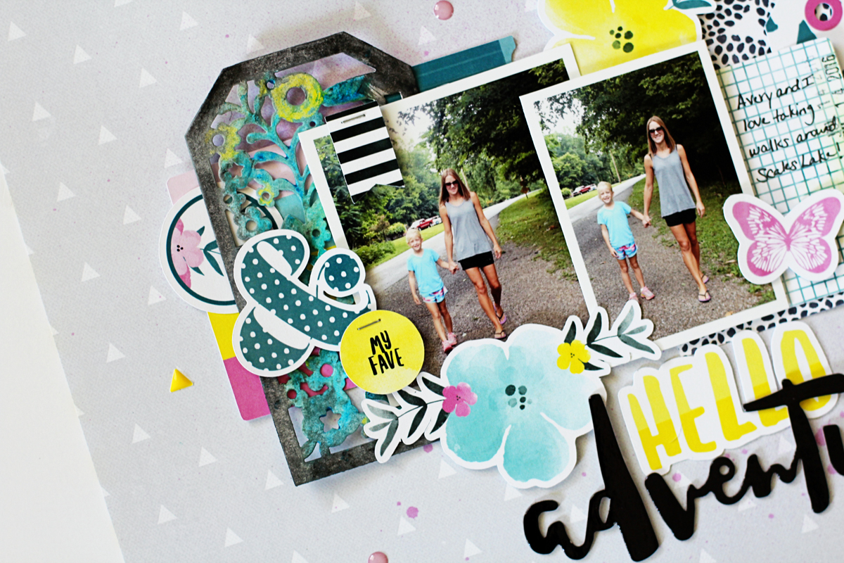
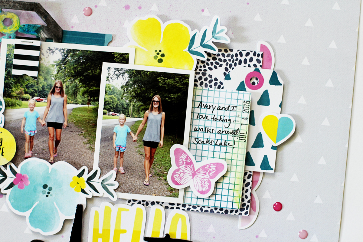
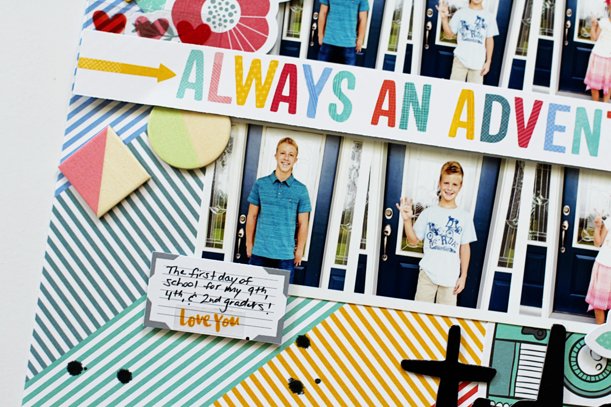
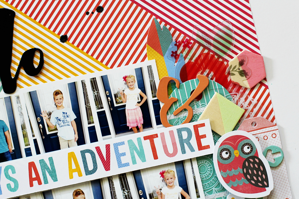
Every year, I take a photo of each of them holding up their hands indicating what year of school they are in before they leave on their first day. I started by printing a photo strip of the photos I took that morning and then printed another one (using the same photos) a little smaller than the first strip so I could layer them under the "Always An Adventure" paper piece from the Amy Tangerine Oh Happy Life patterned paper that's available in the August 2016 Paper Kit. The two different sized photo strips really help to bring the focus to my photos and help them stand out on my page.

hellotoday2

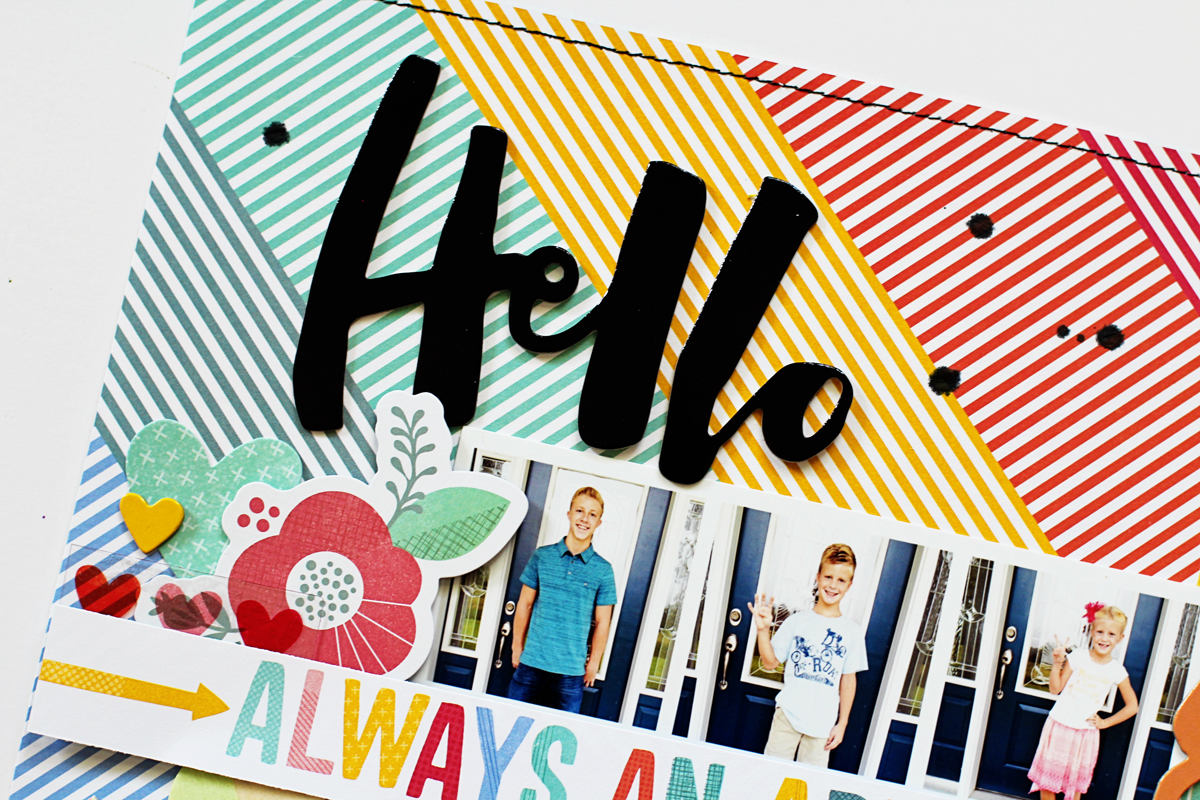
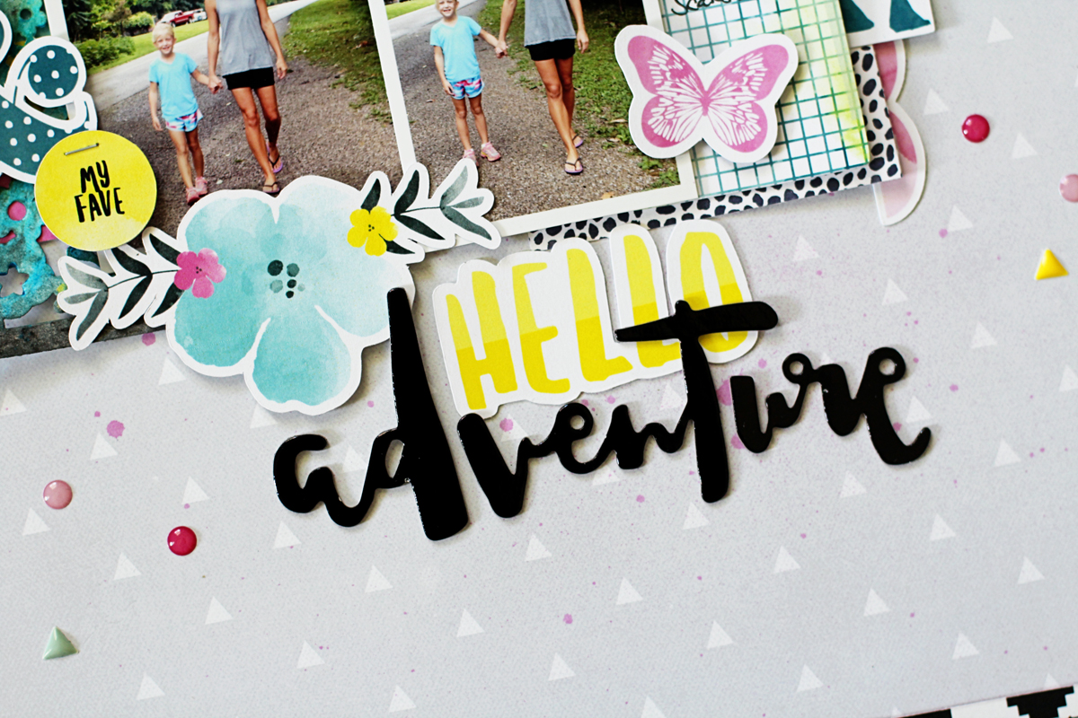
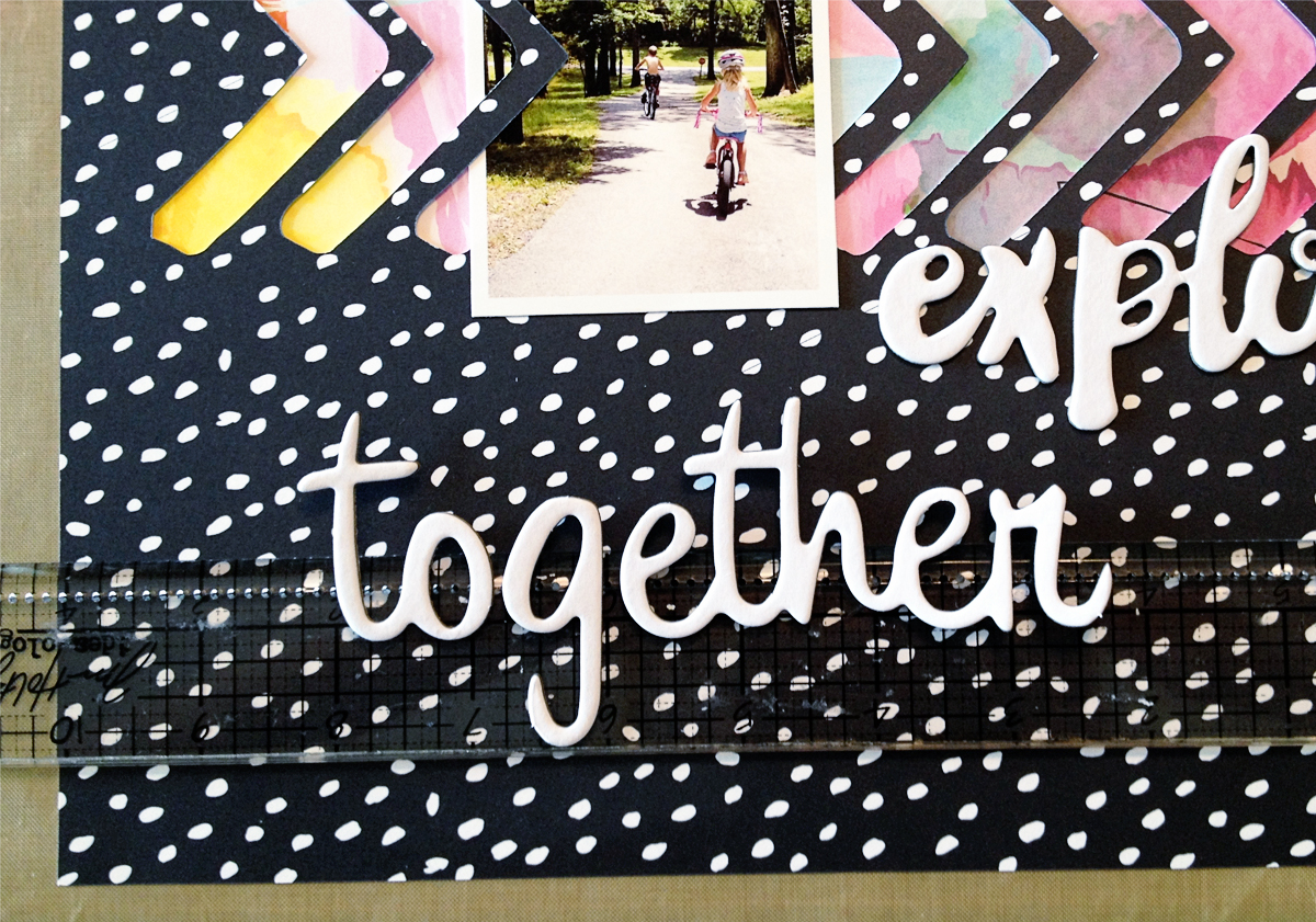
I added my title using some of the Dear Lizzy Saturday Hello Thickers (available in the August 2016 Main Kit) by placing the "Hello" at the top of my page, above the smaller photo strip, and the "Today" near the bottom so it helps to draw the eye diagonally across my page and connect it to the photos.

hellotoday5

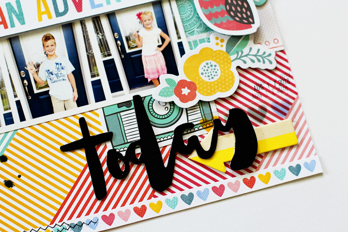
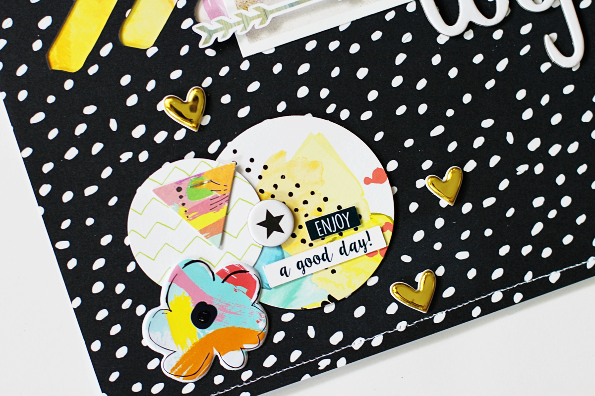
Of course, I couldn't resist adding lots of layers around my page by using a bunch of the Amy Tangerine Oh Happy Life ephemera and Crate Paper Cute Girl wood embellishments, which are also available in the August 2016 Main Kit, because the bright, happy, rainbow colors reminded me of all things back-to-school!

hellotoday6

hellotoday3

I hope I've given you some inspiration on how to focus on and document your kids' back-to-school photos. Thanks so much for joining me today :)

8.17.2016

Hello Adventure *Hip Kit Club*

Hello everyone! 

I posted this layout on the Hip Kit Club blog yesterday sharing a few of my favorite tips and tricks on how to add layers to your pages. Luckily, there are so many great items in the August 2016 Hip Kits to make this process easier and a lot more fun, so let's get started!

helloadventure1

To begin with, you have to think about layers being more than just paper or ephemera pieces added to your page. When I create my pages, I mentally use a layer breakdown of color, patterned paper, photos, embellishments, and miscellaneous items such as machine stitching or paint. For this layout I gathered some of the items that I wanted to use and started by choosing some Coloringz spray ink in Pink Stiletto from Shimmerz (available in the June 2016 Color Kit) and lightly misted some of it onto the patterned paper that I chose to use for my background. So far that's already two layers that I've used from my list above!

helloadventure5

Next, I used some of the Prima Oil Pastels and one of the die cut tags from Amy Tangerine (both available in the August 2016 Color Kit) to create a color coordinating embellishment for my page. I simply rubbed the oil pastels on the tag and then used my water brush to blend the colors. Once the die cut tag was dry, I placed it under the left photo on my page to see if I liked it's placement, which brings me to my next layering tip...don't be afraid to layer photos on top of each other like I did on this page. I printed my photos off at 3x3 and 2x3 so the right one would fit nicely on top of the left one, covering up some of the white space in the photo. I mounted the right photo using some foam tape adhesive which is a great way to add even more dimension to your page and create an extra layer.

helloadventure2

After I committed to my photo placement, I started choosing ephemera pieces from the HKC exclusive ephemera pack, available in the August 2016 Embellishment Kit and started tucking them under, around, and on top of my photos. I also used dimensional foam adhesive for many of these ephemera bits as well because I love how it helps add some extra depth and dimension (just make sure you like the placement of something before you commit to adhering it down!). I also cut a piece of the American Crafts Saturday collection patterned paper from the August 2016 Paper Kit at 3x4 and slipped it under the photo on the right to add even more color contrast to my page and thus creating another layer.

helloadventure3

Another tried and true layering tip that I like to utilize is to overlap the words in my title like I did in the photo below. I used the ephemera "hello" piece and placed the "adventure" phrase from the Dear Lizzy Saturday Hello Thickers sheet (available in the August 2016 Main Kit) and overlapped it slightly on top of the "hello" piece. I also placed several of the My Mind's Eye Hooray enamel dots from the August 2016 Project Life Kit and the Crate Paper Cute Girl small embellishment pack enamel dots around my page, creating yet another layer of color and dimension.

helloadventure4

Ok, so let's review everything we've learned about layers!
  1. Use items such as spray ink, machine stitching, and embellishments to layer instead of just paper.
  2. Don't be afraid to overlap your photos and titles!
  3. Use foam adhesive to lift up certain pieces on your page.
  4. Don't be afraid to cover ephemera and die cut bits up using other embellishments.
  5. Have fun and make sure you like the placement of something before you adhere it to your page!
Well I hope I've given you lots of information on layering and some inspiration on how to use your August 2016 Hip Kits! Thanks so much for joining me today!

8.12.2016

Go See Explore *Shimmerz Paints*

Hello everyone!

I'm guest designing over at Shimmerz Paints this month and I have another layout that I created using a mix of Coloringz, Creameez, and Dazzlerz dimensional paste to share with you!


I started creating this layout by misting some of the Coloringz Night Moves spray onto my background patterned paper. I just randomly picked an area to spray and added a few larger drops from the cap as well.


Next, after the mist dried completely, I used one of my favorite acrylic masks and placed it on top of the misted area and secured it using some washi tape so it wouldn't move around while I added the Dazzlerz Spun Sugar dimensional paste.


As you can see in the photo below, I didn't lay the dimensional paste on super thick because I wanted to add only a slight bit of texture and dimension.


After the paste dried, I added a 12" long strip of patterned paper that I placed my photo and page title on and adhered it using some foam tape. 


Using a watercolor brush, I added some of the Creameez Ride the Tide watercolor to the chipboard letters in my title and squirted a few drops around my entire layout to coordinate with the light blue elements in the patterned paper I chose. 


After placing a few more embellishments around my photo and adding my journaling, my page was complete! 


As I mentioned in my previous guest post, I was always a little shy about using a lot of paint and watercolors on my layouts, but the Shimmerz paints are so easy to use and I'm always amazed at how quickly they dry! 

Thanks so much for joining me and I hope you have a fabulous day! 


8.10.2016

July 2016 Project Life *Hip Kit Club*

Well, another month is in the books! I can't believe how fast this summer is flying by, can you?

I have my Project Life spread for July 2016 to share with you today...


I used the July 2016 Hip Kits to create this spread and I shared it on their Facebook page yesterday. Not to be confused with the Member Forum, the Hip Kit Club Facebook page gives you extra doses of inspiration from our designers every day! Be sure you "like" it on Facebook so it will turn up on your news feed :)


First, I printed my photos and then I used the HKC exclusive journaling cards from the July 2016 Project Life kit and added some of the fun embellishments from Becky Higgins and Amy Tangerine that are available in the kit to dress them up.


I layered several of the die cut ephemera pieces from the July 2016 Embellishment Kit on some of the cards as well as some of the lime green puffy alpha stickers that are available in the July 2016 Main Kit. I love how well the exclusive items from the kits coordinate with my photos from this month! I'm a sucker for bright, happy colors! 


For the right side of my spread, I color coordinated it with the left side so it would look more cohesive. I try to balance out my color schemes visually through my photo placement and journaling card placement before I embellish anything. That way if I need to add a pop of a certain color here or there for visual balance, I can easily add a piece from the kits to do just so. 


I really love how my July 2016 Project Life spread turned out and how easy it was to put together thanks to the lovely July Hip Kits!


Thanks so much for stopping by and I hope you have a great day!

8.07.2016

Loveliness Captured *Pinkfresh Studio*

Hello friends! 

I shared this layout on the Pinkfresh Studio blog late last week. I used the Felicity and Life Noted collections and tried to keep my overall design feminine and girly.


I fussy-cut a bunch of patterned paper pieces from the Felicity 6x6 paper pad and tucked them under the photo of my daughter getting ready to attend her dance recital dress rehearsal this past spring. 


I layered other lovely bits from the Felicity collection around my page such as the die cut pieces and the puffy stickers for added dimension. 


I used one of the silver glitter word phrases and the yellow puffy alpha stickers from the Life Noted collection to complete my title. I also cut a few more triangles out of the floral patterned paper and placed them in two of the corners on my page to soften the overall look. 


Be sure and check out my full post on the Pinkfresh blog and have a wonderful day! 

8.06.2016

Hello Today! *Freckled Fawn*

Hey everyone!

I shared one of my newest layouts using the August 2016 "Chit Chat" Embellishment Kit from Freckled Fawn on their blog yesterday!


The August kit has so many amazing goodies packed inside of it that I was super inspired by this month's kit! Those large, floral acetate words are so cool!!!! I started by placing them along the lines of the patterned paper I chose and stitched them to my page using my sewing machine.


I printed my photos off in different sized diamond shapes and layered them along the angles of the paper as well.


Next, I added several of the epoxy stickers from the kit and lots of those adorable cork foil hearts for added contrast and dimension.


I also added several of the card stock diamond stickers to bring out more of the purple and pink colors that I used on my layout.


The August kit is still up for grabs in the Freckled Fawn shop so be sure and grab yours today!

Thanks so much for stopping by today and I hope you have a wonderful weekend!

8.04.2016

Shimmerz Guest Designer!

Hello everyone!

I'm so excited to be guest designing for Shimmerz over the next couple of months! I have to admit that while I love adding a touch of mist or watercolor to my layouts, sometimes I get really scared that I might end up hating or ruining my entire layout so I end up not using paint very often. I know that's really crazy, but I'm a perfectionist (to a fault) and sometimes it just scares me, lol! Anyway...I overcame all of my fears and perfectionist tendencies and created one of my all time FAVORITE layouts using some amazing products from Shimmerz!!!


I started by using a watercolor brush and dipping it into several of my favorite Shimmerz Coloringz spray mists on top of some white card stock. The Coloringz colors I used were Mandarin Mai Tai, Well Blue Me Down, Pink Stilettos, Pretty In Pink, and Don't Citron Me. I also added a few drips and splatters of each color as well.


Next, I placed some coordinating acetate phrases from Freckled Fawn on top of the color swatches. The Shimmerz Coloringz inks matched the phrases almost perfectly! 


After I placed the acetate phrases on my page, I machine-stitched them down and layered several other phrases from Heidi Swapp on top of them for added dimension and color. I colored each of the Heidi Swapp Watercolor Words using coordinating Creameez colors such as Just Peachie, Good Ol' Summer Time, and Boogie Boardin's Blue with my watercolor brush.


I finished my layout by including the funny faced photo of my daughter and some shiny sequins on top of the white card stock and then I placed the card stock on top of a rainbow chevron striped piece of patterned paper from Bella Blvd. 


If you're like me and scared of using paint, ink, and watercolors on your page then I hope I've inspired you to take the plunge and just do it! I promise that it will be worth the worry and I'm sure, just like me, you'll absolutely LOVE the results! 

Thanks so much for stopping by and I hope you have a fabulous day! 

Shimmerz Supplies Used: Coloringz - Don't Citron Me, Well Blue Me Down, Pretty In Pink, Pink Stilettos, Mandarin Mai Tai; Creameez - Just Peachie, Good Ol' Summer Time, Boogie Boardin' Blue


8.03.2016

Adventure Awaits *Hip Kit Club*

Hello and happy Tuesday, crafty friends! 

There are so many lovely alpha sets, word phrase ephemera, and text bits in the July 2016 Hip Kits that I just had to create a long title for this layout that I shared on the Hip Kit Club blog yesterday!

adventureawaits1

I used one of the July cut files designed by Ashley Horton, cut it out from the B side of the "Ombre Sky" patterned paper, and layered it on top of the "Art Class" patterned paper from The Happy Life collection and then positioned my photo to the left side of my page.

adventureawaits3

Next, I added some Bella Blvd Ciao Chip phrases, available in the July 2016 Main Kit, for part of my long title and then placed a mix of HKC exclusive puffy alpha stickers and the American Crafts foam Thickers, available in the July 2016 Embellishment Kit, for the rest of it.

adventureawaits4

To make positioning different alphas in a long title easier, I used a clear ruler and placed  the letter stickers on it so I could hold it over where I thought I might want them to go before I committed to sticking them on my page. This is a very helpful trick for me!

adventureawaits7

After I was satisfied with my title placement, I layered several punched circles from some of the journaling cards, available in the July 2016 Project Life Kit, and placed them on my page so I could make embellishment clusters out of them. The ephemera phrases from the HKC exclusive "The Happy Life" collection came in handy to add extra color and depth to my page.

adventureawaits2

I also added several of the Happy Life and Freckled Fawn puffy stickers to my page so they would pop and give off a more whimsical vibe.

adventureawaits5

I hope I've inspired you to use lots of alphas and text phrases on your next layout! Thanks so much for stopping by and have a fabulous day!