Pages

3.26.2014

Pretty Things

Hello and happy Wednesday!

I'm sharing two layouts that I created using the lovely color combination of pink, emerald, and gold on the Crate Paper blog today...


I used items from the Styleboard Collection, with a few embellishments and such from the Oh Darling Collection.  Both of these collections are beautiful and full of pretty things.


You can see more information, detailed shots, and how I incorporated the lovely color scheme by visiting the Crate Paper blog.

Thanks for stopping by and have a wonderful day!

3.22.2014

Color Wonder

Happy Saturday!

I'm over on the Scrapbook Circle blog today sharing this layout I created using their March Kit Portabello Road and the Add-on Street Market.


I was really inspired by the circular design of the Racetrack patterned paper and the Boys Rule Plastic Letters from Crate Paper that I arranged the letters in alphabetical order around the lines of the paper.


I added three photos of my two youngest kiddos creating with a big box of crayons on the floor in my craft room.  I placed some of the exclusive flair badges from the March kit around the photos to help direct the eye towards them.


I added a few of the Amy Tangerine Plus One Thicker Twins from the Street Market Add-on as part of my title and in the upper left-hand corner for a bold pop of color.


Be sure and stop by the Scrapbook Circle shop and pick up your March Kit today!

Thanks for stopping by and have a great weekend :)

3.20.2014

A Whole Hand

Hello everyone!

Little Miss A. celebrated her fifth birthday earlier this month and when I asked her how old she was she said, "I'm a whole hand!".  I was so inspired by her adorable reply that I quickly snapped a photo and created a layout to document it.


I used my Silhouette and the Dear Lizzy Lucky Charm 6x6 Paper Pad that's available in the COGC shop for my layout.  You can see my step-by-step process and more information on how this page came together here.


I backed the number 5's on my page with the patterned papers in the Lucky Charm paper pad and used a black pen to create faux stitching around each one.  


I printed my journaling onto vellum and placed the strips underneath the title of my page.

I hope you stop by the COGC blog and check out my full post.  Thanks for stopping by today!

3.18.2014

Always Be True To You

Hello everyone!

I was so inspired by this amazing wall art pin on Pinterest that I decided to create a layout using the same type of geometric heart.


I used the Love Notes Collection from Crate Paper for this page and kept my embellishing minimal so that the geometric heart would stand out.


I machine-stitched around each triangle, added a simple black & white photo of myself, and placed the title of my page on the right side of it.  I stamped arrows from the Love Notes stamp set in black all around the heart to give it a border and to create a little contrast.  I really think the stamping makes it stand out and I was hesitant at first to do it.


Even though the Love Notes Collection is very themed, it can still be used for any type of non-themed project or layout.  It's very versatile and the color palette it gorgeous!  You can find more inspiration using this collection from Crate Paper here.

Have a great day and TFL!

3.17.2014

Snow Day

Happy St. Patrick's Day, everyone!

I created this layout for the March sketch challenge over on the Scrapbook Circle blog.  I used the March kit, Portabello Road, for this page and the Street Market Add-on.


I thought this would be one of the last times we would see snow this year, but boy was I wrong!  We actually got some snow yesterday after it had been 70 degrees on Saturday...crazy I tell ya!


I don't know how they stood the horrible temps...it stayed below twenty degrees that day and there was a layer of ice on top of everything as well.


I absolutely love the Crate Paper Boys Rule Plastic Alphas that are available in the Street Market Add-on.  It will be hard for me not to hoard those :)


Be sure and play along with this month's sketch and get a chance to win a $15 store credit from My Scraps and More!  You can find all of the details here.

Thanks for stopping by and have a great day!

3.16.2014

This Is Life @ 7

Hello everyone!

I created this layout using the March OHDEERME kit from Freckled Fawn.  My youngest son turned 7 last month and I had these candid photos of him blowing out the candles on his cake.


I used the packaging from the triangular stickers in the kit for one of my embellishments.  I love the geometric feel and color pop that it gives my layout.


I typed up my journaling and added some of my son's current favorites and accomplishments on the top left and bottom right sides of my layout.


The rubber sentiment banners are one of my favorite embellishments in this month's kit.  They add such a fun texture and dimension to my page!


Be sure and check out the other creative team members galleries to see how they used the March OHDEERME kit.

Thanks for stopping by!  I hope you have a great day.

3.15.2014

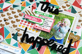
This Happened

Hello everyone!

I shared how I created this layout using the March Kit, Portabello Road, from Scrapbook Circle on their blog last week...


I was inspired by a leftover scrap piece of patterned paper from BasicGrey that's available in this month's kit.  You can check out how this page came together here.


I had a this photo of my daughter from early last Spring when she was being silly and playing with some leaves while we were on a nature walk.  It was such a great candid shot and makes me laugh every time I look at it.


This month's kit is amazing and has lots of exclusive items like the flair badge in the photo above in it.


Thanks for stopping by today.  I hope you have a great weekend!

3.14.2014

March Saturday Sketch Challenge

TGIF!

There's a new Saturday Sketch challenge over at the Come On Get Crafty blog...


And here's my take on the sketch...


My daughter was begging for me to take some pictures of her in a new spring outfit she had on one day when we still had a lot of snow on the ground.  She just couldn't wait to wear it!  And I couldn't resist because she's just so much fun to photograph!


I stuck fairly close to the design of the sketch, but added in extra layers to make it more of my own. I used a lot of Elle's Studio products on this layout that you can find in the COGC shop.


Head over to the COGC blog and check out how the other creative team members used the sketch and play along to get a chance to win a $5 Gift Card to the Come On Get Crafty shop!  Good luck and have a great day!


3.13.2014

My Favorites

Happy Thursday, everyone!

I'm sharing this layout I created for the "Captured Candid"Challenge over on the Scrapbook Circle blog today.


The Designer Take Challenge was to scrap a candid photo.  I had this picture of my husband teaching my son how to play rummy over Christmas break that I thought was perfect for this challenge.  I love how intent their expressions are.


I used the March kit, Portabello Road, for this layout.  This month's kit is packed with lots of bold, bright colors and fun exclusives like the hexagon stencil that I used with modeling paste to add some texture to my layout.


I printed my photo in black & white so it would stand out against all of the colors I used and remain the main focus of my layout.


Head on over to the SBC blog to find out how you can play along with this challenge and get a chance to win a prize pack from American Crafts!

Have a wonderful day and TFL!

3.12.2014

Week 9 for Come On Get Crafty

Hello everyone!  

I'm still trying to play catch-up with my posts on here so today I have my "Everyday life. Documented." spread for Week 9 to share with you today...


Week 9 was a busy one to say the least.  I spent most of it completing DT assignments and preparing to move my husband to Maryland for his job. Since he was still working in Kansas, it was up to me to make all of the arrangements for him so I had quite a bit going on.


Avery and I started the week off by looking for travel trailers so my hubby doesn't have to spend so much money on yucky hotels anymore. And a bonus is that I've been wanting a camper for the past couple of years anyway so it seemed to work out great for everyone!


I didn't take a lot of photos this week so I added in a few extra filler cards and this cute sequin pocket to document the arrival of our new home on wheels.


I layered several Glitz Design journaling cards and stitched them together at the top like the one in the above photo. I like using lots of color in my weekly spreads so they were the perfect addition.


Left Side:


For some reason, I always get motivated to clean my house from top to bottom before going on a trip so I spent two whole days doing just that.  I guess it's so I don't have to do it when we get back home.  Saves me time so I can unpack and do massive amounts of laundry, lol!


We began the month of March ready for a new chapter and a brand new adventure...


We'll see how it goes...


Right Side:


And here's my full spread for Week 9, 2014...


Everything I used for this week's spread can be purchased in the Come On Get Crafty online shop.  Be sure and stop by and check out COGC's fresh new look and blog website!


Thanks for stopping by today!

3.07.2014

Custom Insert for Life Pages Spread

Happy Friday, friends!

I created a customized insert for my Life Pages spread for Week 7 documenting my son's 7th birthday...


I wanted to include all of his birthday photos without taking up extra space in my normal weekly spread so I altered a pocket protector using my paper trimmer and my sewing machine.  You can find out the details on how I did that here.


I used Gossamer Blue's March kits and digital cut files for my insert...the mint, blue, and dark green pair so well with the gold foil paper and accents.


Here's a look at the reverse side of my insert...


I added some journaling on this side documenting how we celebrated my youngest son's seventh birthday...even thought we kept the celebrations simple this year, he said it was "the best birthday ever!" and is ready to go bowling again :)


To see my full post and for more information and detailed photos on how I converted my pocket page, head on over to the Gossamer Blue blog.

Thanks for stopping by and have a great day!